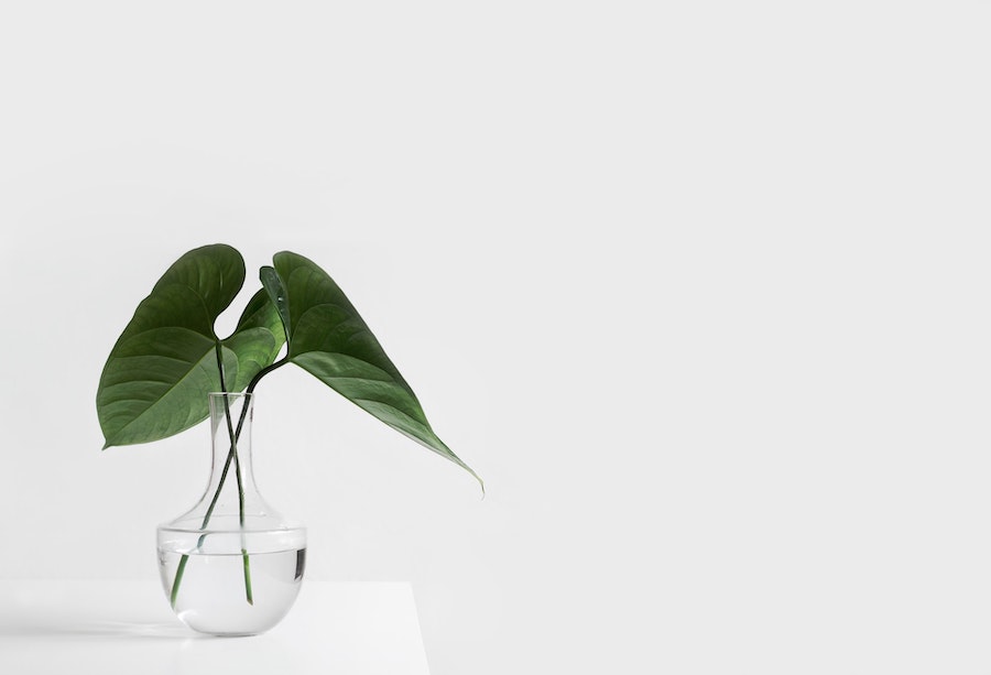
Minimalism is an exercise in trimming the fat. It shows in interior design, fine art, and especially in branding. Typically, what comes to mind is white, empty space, with small areas of boldness. In web design, that means drawing attention to the most important elements of your website, and not filling your website with elaborate colors and features. Simplicity is the name of the game here. If you’re looking to upgrade your website design, take a look at our tips for doing minimalism right.

Do remember to balance
Just about everything in design comes down to balance. Accent walls are big in interior design because the 70’s taught us that patterned walls were a headache, the athleisure fashion trend balances tight cycle shorts with overly huge hoodies and t-shirts.
Web design is no different. When it comes to minimalism, it’s easy to set everything off-balance. Do too much and the site looks cluttered, do too little, and your users will wonder why you bothered.
Balancing the color is also very important. Balance almost or entirely empty white space with your featured elements, such as text, images, or another color to ensure that there’s not too much. You should also look to balance shapes and layout. The grid layout is particularly common in minimalism since rectangles and squares offer a neater shape to content on the site more than circular or warbly shapes would.
Don’t get creative with fonts
Every website requires some text, even if it’s simply your brand name. Minimalism is not the place for swirling or whacky fonts. There is no place for Comic Sans here. You’re looking for bold and simple. Even Times New Roman would be a little too embellished for minimalism. Think about slick, simple, and bold fonts.
The same might be said for imagery too. If you’re looking to put any photos on the site, make sure they offer white space, one non-neutral color, and simple shape.
Do cut out the clutter
The point of minimalism, particularly in interior design, is to remove clutter. A tidy home is a tidy mind as they say, so décor is kept to a minimum and patterns are outlawed from walls. The same rules apply to web design. Keep patterns simple, and anything that isn’t essential needs to go. Stick with the company name and point and save the details for the pages within the website.
Don’t pack everything in
On the opposite end, you don’t want to pack everything into the navigation bar. Keep your menu basic so as to stick to the minimalist design. Give everything room to breathe. You can add subcategories to menu tabs, but like minimalist interior design, they will be hidden away. Under a tab rather than behind a closed cabinet door.
Do choose color
Minimalism doesn’t mean sticking to white and/or black. A striking element of minimalism in interior design is to soften the cold clashing white walls with black décor and to introduce a warm accent wall. That can be beige or a deep brown or any other neutral tone. Use a neutral tone as the basis of your website and add one pop of color to warm it up and give something for your eyes to look at. Maybe swap out the black in the font for a navy blue or dark brown to give it something a little different. The key is to keep the balance by keeping these changes to a minimum. Don’t go filling every detail with crimson red unless it serves a purpose to the brand.
If you don’t want to go for a neutral that isn’t black or white, go into the idea knowing what those two colors represent. There is going to be a lot of it on the site, which emphasizes its symbolism. Black is known to represent mystery, style, technology, etc. while white means purity and honesty, so it’s mostly implemented in beauty, health, and finance sites.
Don’t sacrifice clarity for simplicity
No matter what you do, keep the customer experience in mind. If you are trimming the clutter in the site, make sure that any relevant information has somewhere to go within the site. Make sure that it’s easy and clear to find, and make sure that your user can figure out what you’re all about without it. Don’t start eliminating important elements all over the site because it will look neater. Have the navigation seamlessly take the user from point A, where the bare bones of information are presented, to point B, where they can find more information.
Conclusion
It’s easy to get minimalism wrong. You might add too much and lose the entire point of minimalism, or you could do too little and bore your users right off the site. It’s all about balance. But if you keep these points running through your mind throughout your web design journey, you should nail it.
Disclosure: We might earn commission from qualifying purchases. The commission help keep the rest of my content free, so thank you!


